9. MAUI
MAUI is Microsoft's cross platform framework, it is the successor of Xamarin.Forms. It runs on Windows, Mac, iOS and Android, unfortunately not on Linux.
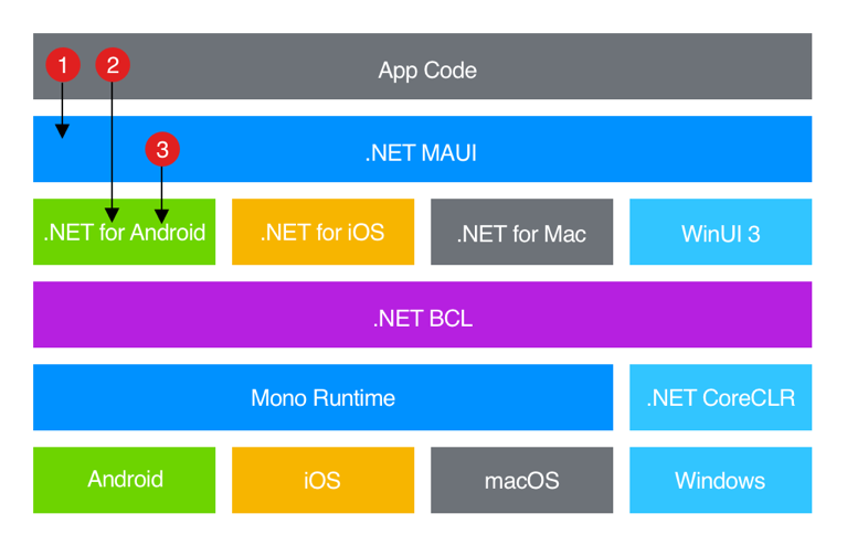
"In a .NET MAUI app, you write code that primarily interacts with the .NET MAUI API (1). .NET MAUI then directly consumes the native platform APIs (3). In addition, app code may directly exercise platform APIs (2), if required.
.NET MAUI apps can be written on PC or Mac, and compile into native app packages:
- Android apps built using .NET MAUI compile from C# into an intermediate language (IL) which is then just-in-time (JIT) compiled to a native assembly when the app launches.
- iOS apps built using .NET MAUI are fully ahead-of-time (AOT) compiled from C# into native ARM assembly code.
- macOS apps built using .NET MAUI use Mac Catalyst, a solution from Apple that brings your iOS app built with UIKit to the desktop, and augments it with additional AppKit and platform APIs as required.
- Windows apps built using .NET MAUI use Windows UI 3 (WinUI 3) library to create native apps that target the Windows desktop. For more information about WinUI 3."1
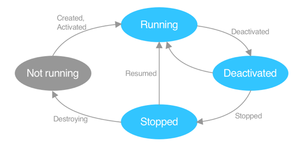
The following diagram shows an overview of the .NET MAUI app lifecycle:
9.1 Getting started
- MacOS Environment Setup for MAUI Development with Rider
- Windows Environment Setup for MAUI Development with Visual Studio Community -- Rider does not support hot reload on Windows. If you want to build Windows Application with MAUI, use Visual Studio instead of Rider.
- Linux Environment Setup for MAUI Development with VS Code
First App
Create a new solution based on the template MAUI, run it and try to understand the code.
Check out .Net MAUI Architecture Overview to understand, how everything is clued together.
9.2 Folder Structure
According to Enterprise Application Patterns use the following folder structure
- Animations: Contains classes that enable animations to be consumed in XAML.
- Behaviors: Contains behaviors that are exposed to view classes.
- Controls: Contains custom controls used by the app.
- Converters: Contains value converters that apply custom logic to a binding.
- Exceptions: Contains custom exceptions.
- Extensions: Contains extension methods for the VisualElement and IEnumerable
classes. - Helpers: Contains helper classes for the app.
- Data: Contains everything related to data management.
- Models: Contains the model classes for the app.
- EntityFramework: Contains the database context, migrations, and repository classes.
- Properties: Contains AssemblyInfo.cs, a .NET assembly metadata file.
- Resources: Contains static resources like styles, themes, icons, images and other resources used throughout the application.
- Services: Contains interfaces and classes that implement services that are provided to the app.
- Triggers: Contains the BeginAnimation trigger, which is used to invoke an animation in XAML.
- Validations: Contains classes involved in validating data input.
- ViewModels: Contains the application logic that’s exposed to pages.
- Views: Contains the pages for the app.
9.3 UI
Here you find all built-in controls.
There is no visual designer and no preview in the IDE. But, Rider on Mac supports hot reload on iphone emulators and Visual Studio Community on Windows supports hot reload for Android emulators.
The NET MAUI Community Toolkit is a collection of reusable elements for application development with .NET MAUI, including animations, behaviors, converters, effects, and helpers.
Syncfusion offers great controls for MAUI. As a student you may apply for a free license.
9.3.1 Layout
.NET Multi-platform App UI (.NET MAUI) layout classes allow you to arrange and group UI controls in your application.
Initially, it is beneficial to start with VerticalStackLayout, which arranges all child controls vertically, one below the other.
9.3.1.1 Grid
The grid layout is the most flexible and powerful layout.
" The Grid class defines the following properties:
- Column, of type int, which is an attached property that indicates the column alignment of a view within a parent Grid. The default value of this property is 0. A validation callback ensures that when the property is set, its value is greater than or equal to 0.
- ColumnDefinitions, of type ColumnDefinitionCollection, is a list of ColumnDefinition objects that define the width of the grid columns.
- ColumnSpacing, of type double, indicates the distance between grid columns. The default value of this property is 0.
- ColumnSpan, of type int, which is an attached property that indicates the total number of columns that a view spans within a parent Grid. The default value of this property is 1. A validation callback ensures that when the property is set, its value is greater than or equal to 1.
- Row, of type int, which is an attached property that indicates the row alignment of a view within a parent Grid. The default value of this property is 0. A validation callback ensures that when the property is set, its value is greater than or equal to 0.
- RowDefinitions, of type RowDefinitionCollection, is a list of RowDefinition objects that define the height of the grid rows.
- RowSpacing, of type double, indicates the distance between grid rows. The default value of this property is 0.
- RowSpan, of type int, which is an attached property that indicates the total number of rows that a view spans within a parent Grid. The default value of this property is 1. A validation callback ensures that when the property is set, its value is greater than or equal to 1.
The RowDefinition class defines a Height property, of type GridLength, and the ColumnDefinition class defines a Width property, of type GridLength. The GridLength struct specifies a row height or a column width in terms of the GridUnitType enumeration, which has three members:
- Absolute – the row height or column width is a value in device-independent units (a number in XAML).
- Auto – the row height or column width is autosized based on the cell contents (Auto in XAML).
- Star – leftover row height or column width is allocated proportionally (a number followed by * in XAML).
Child views in a Grid can be positioned within their cells by the HorizontalOptions and VerticalOptions properties. These properties can be set to the following fields from the LayoutOptions struct: Start, Center, End, Fill.
Caution
Try to ensure that as few rows and columns as possible are set to Auto size. Each auto-sized row or column will cause the layout engine to perform additional layout calculations. Instead, use fixed size rows and columns if possible. Alternatively, set rows and columns to occupy a proportional amount of space with the GridUnitType.Star enumeration value.
Important
The deeper you nest Grid objects and other layouts, the more layout calculations will be performed which may impact performance.
"2
Below, you'll find a comprehensive example that demonstrates most of the possibilities described above. While it may not be aesthetically pleasing, it effectively illustrates the concepts discussed ;)

<Label Text="Grid with RowDefinitions: Auto, 200, * and ColumnDefinitions *, 2*"/>
<Grid BackgroundColor="Azure">
<Grid.RowDefinitions>
<RowDefinition Height="Auto" />
<RowDefinition Height="200" />
<RowDefinition Height="*" />
</Grid.RowDefinitions>
<Grid.ColumnDefinitions>
<ColumnDefinition Width="*" />
<ColumnDefinition Width="2*" />
</Grid.ColumnDefinitions>
<Label Text="0, 0"
BackgroundColor="LightBlue"
Grid.Row="0" Grid.Column="0" />
<Label Text="0,1"
BackgroundColor="LightGreen"
Grid.Row="0" Grid.Column="1" />
<Label Text="1,0 RowSpan: 2 VerticalOptions: End"
BackgroundColor="Yellow"
Grid.Row="1" Grid.Column="0" Grid.RowSpan="2"
VerticalOptions="End" />
<Label Text="1, 1 VerticalOptions: Center"
BackgroundColor="Red"
VerticalOptions="Center"
Grid.Row="1" Grid.Column="1" />
<Label Text="2,1 HorizontalOptions: Center"
BackgroundColor="Gray"
HorizontalOptions="Center"
Grid.Row="2" Grid.Column="1" />
</Grid>
Below you find another example with a grid

<Grid HeightRequest="400">
<Grid.RowDefinitions>
<RowDefinition Height="Auto" />
<RowDefinition Height="*" />
<RowDefinition Height="50" />
</Grid.RowDefinitions>
<Grid.ColumnDefinitions>
<ColumnDefinition Width="Auto" />
<ColumnDefinition Width="*" />
<ColumnDefinition Width="100" />
</Grid.ColumnDefinitions>
<Image
HeightRequest="50"
Source="https://aka.ms/campus.jpg" />
<Label Text="Heading"
Grid.ColumnSpan="2" Grid.Row="0" Grid.Column="1"
HorizontalTextAlignment="Center" VerticalTextAlignment="Center"
BackgroundColor="LightBlue" />
<Label Text="Info Left"
Grid.Row="1" Grid.Column="0"
VerticalTextAlignment="Start" HorizontalTextAlignment="Center"
BackgroundColor="LightSkyBlue" />
<Label Text="Main Content lorum ipsum... Row: 1, Col: 1 LineBreakMode:WordWrap VerticalOptions: StartAndExpand HorizontalOptions:CenterAndExpand"
Grid.Row="1" Grid.Column="1"
VerticalTextAlignment="Start" HorizontalTextAlignment="Center"
LineBreakMode="WordWrap"
BackgroundColor="LightGray"/>
<Label Text="side info"
Grid.Column="2" Grid.RowSpan="2"
HorizontalTextAlignment="Center" VerticalTextAlignment="Center"
BackgroundColor="LightSkyBlue" />
<Label Text="Footer, fixed 100 height bei RowDefinition"
Grid.Row="2" Grid.Column="0" Grid.ColumnSpan="3"
HorizontalTextAlignment="Center" VerticalTextAlignment="Center"
BackgroundColor="LightBlue" />
</Grid>
Key concepts to keep in mind
*uses the remaining space.- HorizontalTextAlignment: Determines how the text is positioned horizontally within a control (e.g., left, center, right).
- HorizontalOptions: Determines how a control should be positioned horizontally within its parent layout (e.g., left, center, right, fill).
9.3.1.2 ListView vs CollectionView
When displaying list data, you have two primary control options: ListView and CollectionView. Choose ListView if you do not require any of the following advanced features
- multiple selection
- load more (treshold)
- layout horizontal, grid or custom
If your application requires any of these features, consider using CollectionView instead.
9.3.2 Binding of Controls and Converter
As discussed in data-binding, you can use binding to connect controls with properties of view models. In this section, we will use binding to connect controls to each other. In addition we will use a converter.
The converter takes a double value and returns an RGB color. This double value specifies the intensity of the red component, while the green and blue components are fixed at 0.
namespace Demo.Converters
{
public class DoubleRedToColorConverter : IValueConverter
{
public object Convert(object value, Type targetType, object parameter, CultureInfo culture)
{
if (value is double sliderValue)
{
return Color.FromRgb((int)sliderValue, 0, 0); // Red component
}
return Color.FromRgb(0, 0, 0); // Default color
}
public object ConvertBack(object value, Type targetType, object parameter, CultureInfo culture)
{
throw new NotImplementedException(); // not needed
}
}
}
- need to define the namespace with
xmlns:converters="clr-namespace:Demo.Converters - define a key to access the converter in
ResourceDictionary
The example uses the converter to bind the slider to the red component of the label's background colour, while the input field is bound to the label's text.
To enable binding between controls, you must assign a name to each control using the x:Name attribute
<?xml version="1.0" encoding="utf-8" ?>
<ContentPage xmlns="http://schemas.microsoft.com/dotnet/2021/maui"
xmlns:x="http://schemas.microsoft.com/winfx/2009/xaml"
x:Class="Demo.Views.BindingDemoPage"
xmlns:converters="clr-namespace:Demo.Converters"
Title="Binding Demo">
<ContentPage.Resources>
<ResourceDictionary>
<converters:DoubleRedToColorConverter x:Key="DoubleRedToColorConverter" />
</ResourceDictionary>
</ContentPage.Resources>
<VerticalStackLayout Padding="10">
<Entry x:Name="TextInput"
Placeholder="Enter text"
HorizontalOptions="FillAndExpand" />
<Slider x:Name="RedSlider"
Minimum="0"
Maximum="255"
Value="0"
HorizontalOptions="FillAndExpand" />
<!-- Label that displays the text and has a background color based on the slider -->
<Label Text="{Binding Text, Source={x:Reference TextInput}}"
HorizontalOptions="FillAndExpand"
BackgroundColor="{Binding Value, Source={x:Reference RedSlider}, Converter={StaticResource DoubleRedToColorConverter}}" />
</VerticalStackLayout>
</ContentPage>
9.3.3 Behaviors
Behaviors enable you to implement code that you would normally have to write as code-behind, because it directly interacts with the API of the control in such a way that it can be concisely attached to the control and packaged for reuse across more than one application.
9.3.4 Gestures
MAUI supports Drag&Drop, Pan, Pinch, Pointer, Swipe and Tap.
9.3.5 Accessibility
With MAUI you can and should develop accessible apps. The SemanticProperties class defines the following attached properties
- Description, of type string, which represents a description that will be read aloud by the screen reader. For more information, see Description.
- Hint, of type string, which is similar to Description, but provides additional context such as the purpose of a control. For more information, see Hint.
- HeadingLevel, of type SemanticHeadingLevel, which enables an element to be marked as a heading to organize the UI and make it easier to navigate. For more information, see Heading levels.
<Label Text="Get started with .NET MAUI"
SemanticProperties.HeadingLevel="Level1" />
<Image Source="like.png"
SemanticProperties.Description="Like"
SemanticProperties.Hint="Like this post." />
9.3.6 Localization
Localization is the process of adapting an app to meet the specific language or cultural requirements of a target market. To localize an app, its text and images might need to be translated into multiple languages. A localized app automatically displays translated text based on the culture settings of the device. To add localization to your app, follow the instructions of Microsoft, Localization.
9.4 Storage
As shown in the notes app, you may store data in files.
The Preferences API in .NET MAUI is designed for storing simple key-value pairs of basic data types such as boolean, string, and integer. It's primarily used for saving application settings and other small pieces of data that need to persist across app sessions.
// Set a string value:
Preferences.Default.Set("first_name", "John");
// read it
string firstName = Preferences.Default.Get("first_name", "Unknown");
// check
bool hasKey = Preferences.Default.ContainsKey("my_key");
9.5 Navigation
".NET Multi-platform App UI (.NET MAUI) Shell reduces the complexity of app development by providing the fundamental features that most apps require, including:
- A single place to describe the visual hierarchy of an app.
- A common navigation user experience.
- A URI-based navigation scheme that permits navigation to any page in the app.
- An integrated search handler.
In a .NET MAUI Shell app, the visual hierarchy of the app is described in a class that subclasses the Shell class. This class can consist of three main hierarchical objects:
- FlyoutItem or TabBar. A FlyoutItem represents one or more items in the flyout, and should be used when the navigation pattern for the app requires a flyout. A TabBar represents the bottom tab bar, and should be used when the navigation pattern for the app begins with bottom tabs and doesn't require a flyout. For more information about flyout items, see .NET MAUI Shell flyout. For more information about tab bars, see .NET MAUI Shell tabs.
- Tab, which represents grouped content, navigable by bottom tabs. For more information, see .NET MAUI Shell tabs.
- ShellContent, which represents the ContentPage objects for each tab. For more information, see .NET MAUI Shell pages.
These objects don't represent any user interface, but rather the organization of the app's visual hierarchy. Shell will take these objects and produce the navigation user interface for the content."3
Simple Navigation
For a good introduction watch Navigating Between Pages in .NET MAUI [6 of 8] | .NET MAUI for Beginners.
The visual hierarchy is defined in xml, AppShell.xaml.
The following code defines the initial pages. On mobile devices, this will be displayed as a bottom navigation bar, while on desktop, it will appear as tabs.
<TabBar>
<ShellContent Title="Main"
Icon="home.svg"
ContentTemplate="{DataTemplate pages:MainPage}" />
<ShellContent Title="Students"
Icon="university.svg"
ContentTemplate="{DataTemplate pages:StudentsPage}" />
</TabBar>
Put the svg-files into the folder Ressources/Images. You may find good svg on one of the following sites
To define a navigation drawer/flyout navigation on mobile use the following code.
<FlyoutItem Title="Main">
<ShellContent ContentTemplate="{DataTemplate pages:MainPage}"/>
</FlyoutItem>
<FlyoutItem Title="Students" >
<ShellContent ContentTemplate="{DataTemplate pages:StudentsPage}"/>
</FlyoutItem>
And to use the Flyout for desktop+tablet and the tabbar for mobile only define both as above and
1. Add in XAML <Shell ... FlyoutBehavior="{OnIdiom Phone=Disabled, Default=Locked}"...
2. Add a name to your TabBar <TabBar x:Name="PhoneTabs">
3. In your App.xaml.cs add
public AppShell()
{
InitializeComponent();
if (DeviceInfo.Idiom != DeviceIdiom.Phone)
Shell.SetTabBarIsVisible(this, false);
}
Sub/details pages should be defined in AppShell after InitializeComponent, e.g.
Routing.RegisterRoute("students/demo", typeof(DemoPage));
To navigate to this page from the students page use await Shell.Current.GoToAsync("demo");.
And parameters may be passed as query parameters, e.g. await Shell.Current.GoToAsync("demo?name=xxx"); and the receiving part of the parameter looks like
[QueryProperty(nameof(Name), "name")]
public partial class DemoPage : ContentPage
{
string _name;
public string Name
{
get => _name;
set
{
_name = value;
OnPropertyChanged();
}
}
...
}
// or with a ViewModel
public class StudentDetailViewModel : IQueryAttributable, INotifyPropertyChanged
{
public string Name { get; private set; }
public void ApplyQueryAttributes(IDictionary<string, object> query)
{
Name = query["name"] as string;
OnPropertyChanged("Name");
}
...
}
Tip
Use Shell or Tabbed/Flyout/Nav, not both.
9.6 MVVM
To write less boilerplate code it is suggested to use the nuget package MVVM Toolkit. MVVM Toolkit Features gives you a good introduction into MVVM and how to use the toolkit in MAUI. The figure above shows you the weather sample app, analyze the source code to get an idea how typical problems are solved in MAUI.
9.6.1 Learning Path
- Simple Notes App - about 50min
- Upgrade your app with MVVM concepts - about 1h
9.6.2 Basic Structure of MAUI with MVVM and Dependency Injection
"Dependency injection is a specialized version of the Inversion of Control (IoC) pattern, where the concern being inverted is the process of obtaining the required dependency. With dependency injection, another class is responsible for injecting dependencies into an object at runtime.
Typically, a class constructor is invoked when instantiating an object, and any values that the object needs are passed as arguments to the constructor. This is an example of dependency injection known as constructor injection.
Before dependencies can be injected into an object, the types of the dependencies must first be registered with the container. Registering a type involves passing the container an interface and a concrete type that implements the interface.
There are two ways of registering types and objects in the container through code:
- Register a type or mapping with the container. This is known as transient registration. When required, the container will build an instance of the specified type.
- Register an existing object in the container as a singleton. When required, the container will return a reference to the existing object."4 A singleton is a design pattern that ensures a class has only one instance and provides a global point of access to that instance.
Register the dependencies in MauiProgram.cs
public static MauiApp CreateMauiApp()
{
var builder = MauiApp.CreateBuilder();
builder
.UseMauiApp<App>()
.UseMauiCommunityToolkit()
...
// register all ViewModels, Views, ... with dependencies in their constructor
builder.Services.AddDbContext<DogDb>()
.AddTransient<DogListViewModel>()
.AddTransient<DogListPage>()
return builder.Build();
}
In each ViewModel with Dependencies to the db implement IDisposable
public partial class DogListViewModel : ObservableObject, IDisposable
{
private DogDb db;
...
public DogListViewModel(DogDb db)
{
this.db = db;
...
}
public void Dispose()
{
db.Dispose();
}
// example usage of MVVM Community Toolkit annotations
// these annotations need partial, as code is generated
// generates a public bindable property Name with INotifyPropertyChanged
[ObservableProperty]
string _name;
// generates bindable command like IRelayCommand UpdateDogCommand => UpdateDog
[RelayCommand]
private void UpdateDog(){...}
}
In each View related to a ViewModel with a Dependency add
public partial class DogListPage : ContentPage
{
public DogListPage(DogListViewModel vm)
{
InitializeComponent();
BindingContext = vm;
}
}
<ContentPage
xmlns:viewModels="clr-namespace:Lab3.ViewModels"
x:DataType="viewModels:DogListViewModel"
Hint
Note that each XAML page can only have one x:DataType, which serves as the primary binding context. However, when working with collections, such as a CollectionView bound to a list of dogs, you may need to define additional data types (valid for a specific tag only) to access properties of individual items, like the name of a specific dog.
<ContentPage
xmlns:viewModels="clr-namespace:Lab3.ViewModels"
x:DataType="viewModels:DogListViewModel"
xmlns:models="clr-namespace:Lab3.Data.Models"
...
>
...
<CollectionView ItemsSource="{Binding Dogs}">
<CollectionView.ItemTemplate>
<DataTemplate x:DataType="models:Dog">
<Label Text="{Binding Name}" />
...
<CollectionView ItemsSource="{Binding Dogs}">binds to the propertyDogsofDogListViewModel<Label Text="{Binding Name}" />binds to the propertyNameofModels.Dog
9.7 Access REST
The best way to access remote data is to implement a service, see
- Consume REST web services in .NET MAUI apps
- Accessing remote data and the complete app source code eshop-mobile-client.
9.8 Putting things together
Read the article Putting things together how to put REST, MVVM ... together and build a very simple and minimalistic Reddit browser for a select number of subreddits.
9.9 Further Reading
- Architecture Guide -- an example of a enterprise application with backend and different clients.
- Build mobile and desktop apps with .NET MAUI provides a very good introduction into .Net MAUI including how to consume a REST service.
- Official .NET MAUI Samples
- .Net MAUI Workshop with
video
-
David Britch. What is .net maui? - .net maui. 2023. URL: https://learn.microsoft.com/en-gb/dotnet/maui/what-is-maui?view=net-maui-8.0 (visited on 05.03.2024). ↩
-
David Britch. Grid. 2024. URL: https://learn.microsoft.com/en-gb/dotnet/maui/user-interface/layouts/grid?view=net-maui-8.0 (visited on 25.07.2024). ↩
-
David Britch. Dependency injection. 2023. URL: https://learn.microsoft.com/en-us/dotnet/maui/fundamentals/shell/?view=net-maui-8.0 (visited on 30.07.2024). ↩
-
Michael Stonis. Dependency injection. 2024. URL: https://learn.microsoft.com/en-us/dotnet/architecture/maui/dependency-injection (visited on 25.07.2024). ↩